
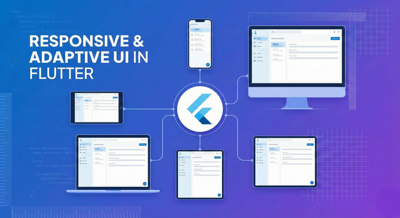
Building Responsive and Adaptive User Interfaces in Flutter (2025 Guide)
As digital products continue to expand across mobile, web, desktop, and emerging device sizes, building responsive and adaptive interfaces has never been more important. Flutter, with its powerful widget system and flexible layout tools, provides one of the most robust frameworks for crafting interfaces that look great on any screen.
This guide explores how to build responsive and adaptive UI in Flutter, the best practices to follow in 2025, and how you can ensure a consistent experience across all platforms.
Introduction to Responsive Design in Flutter
Responsive UI ensures that an application adjusts its layout, spacing, typography, and navigation depending on the device’s screen size. With Flutter supporting mobile, tablet, desktop, web, and foldable devices, implementing proper responsive design has become fundamental.
Flutter provides tools such as:
-
MediaQuery -
LayoutBuilder -
OrientationBuilder -
FlexibleandExpandedwidgets -
Breakpoints
-
Adaptive navigation patterns
These tools help developers create interfaces that scale gracefully across various screen dimensions.
Key Principles of Responsive Flutter Design
1. Use Breakpoints to Adjust Layouts
Breakpoints define layout changes at specific screen widths. While the exact values can vary by project, common breakpoints for Flutter apps include:
-
Small screens (up to 600 px): mobile
-
Medium screens (600–1024 px): tablets
-
Large screens (1024 px and up): desktop or web
Using LayoutBuilder is often preferred because it provides the parent constraints directly:
Dart
LayoutBuilder(
  builder: (context, constraints) {
    if (constraints.maxWidth < 600) {
      return MobileLayout();
    } else if (constraints.maxWidth < 1024) {
      return TabletLayout();
    } else {
      return DesktopLayout();
    }
  },
);
This structure allows you to maintain multiple layouts without duplicating business logic.
2. Use Flexible and Expanded Widgets
Horizontal layouts can break on smaller screens if widgets do not have flexibility. Flutter’s Flexible and Expanded widgets allow content to resize dynamically:
Dart
Row(
  children: [
    Expanded(child: Sidebar()),
    Expanded(flex: 3, child: ContentArea()),
  ],
);
This approach ensures equal spacing on larger screens while preventing layout overflow on smaller ones.
3. Leverage MediaQuery for Screen Size and Orientation
MediaQuery allows you to respond to screen width, height, pixel density, and orientation. For example:
Dart
final size = MediaQuery.of(context).size;

if (size.width < 600) {
  return MobileHome();
} else {
  return DesktopHome();
}
Use MediaQuery for dynamic sizing, but avoid placing complex logic in too many widgets.
4. Build an Adaptive UI for Different Platforms
Responsive UI handles screen sizes, while adaptive UI handles platform differences. Flutter supports platform adaptation for navigation behaviour, scroll physics, typography, keyboard shortcuts, and pointer interactions (mouse vs. touch).
To better understand the difference between responsive and adaptive design, consider this diagram:
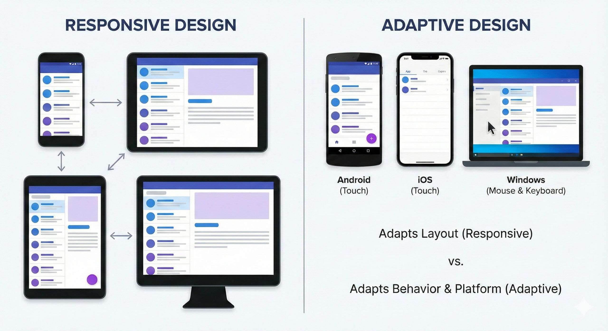
A modern Flutter app should behave naturally across devices, from Android phones to Windows desktops. For example, adapting scroll behaviour:
Dart
ScrollConfiguration(
  behavior: ScrollBehavior().copyWith(
    physics: isDesktop ? const ClampingScrollPhysics() : const BouncingScrollPhysics(),
  ),
  child: ListView(),
);
5. Use Flutter’s Built-In Adaptive Navigation Patterns
As apps grow, navigation becomes a core part of responsive design. Flutter’s Material Design guidelines offer:
-
Bottom navigation for mobile
-
Navigation rail for tablet
-
Navigation drawer for desktop
This improves usability and reduces screen clutter.
Responsive Text and Spacing
Typography and spacing should scale with the screen size. You can use MediaQuery.of(context).textScaleFactor to adjust font sizes or integrate libraries like flutter_screenutil and responsive_framework to streamline spacing and breakpoints.
Handling Images and Media Responsively
Images can distort or overflow on smaller devices. To avoid layout issues, use BoxFit.contain or BoxFit.cover, wrap images with Flexible or Expanded, and cache and scale images for performance.
Foldable and Dual-Screen Device Support
As foldable devices grow in popularity, Flutter includes improved support for hinge detection, dual-layout design, and multi-window scenarios. Developers can use packages like dual_screen to build dual-view interfaces that enhance user experience on foldables.
Conclusion
Responsive and adaptive design has become a fundamental requirement for modern Flutter applications. With support for mobile, web, desktop, and foldable devices, Flutter provides powerful tools that make it easier than ever to build flexible, scalable, and visually consistent interfaces.
By using breakpoints, adaptive layouts, platform-specific behaviors, and modern design patterns, developers can deliver applications that feel natural across any screen size. As the ecosystem continues to evolve in 2025, mastering responsive design in Flutter is essential for building future-ready digital products.